
Project Introduction
When designing a website, paying attention to even the smallest details—like the search box—can make a huge difference. The search bar is one of the most critical elements of any website. It acts as a bridge, connecting users to the content they’re looking for. It’s where users type their queries or search terms to retrieve relevant data from your database.
In this tutorial, I’ll walk you through creating a sleek, pure CSS animated search box using only HTML and CSS—no JavaScript or external libraries required. By the end of this guide, you’ll have a beautifully animated search box that enhances your website’s user experience.
Ready to get started? Let’s dive in!
Prerequisites
Before we begin, make sure you have:
- A basic understanding of HTML and CSS.
- A code editor like Visual Studio Code or Sublime Text to write and save your code.
Step 1: Setting Up the HTML Structure
First, let’s create the basic HTML structure for our search box. We’ll use semantic HTML to ensure our code is clean and accessible.
Here’s the HTML code:
<!DOCTYPE html>
<html lang="en">
<head>
    <meta charset="UTF-8">
    <meta http-equiv="X-UA-Compatible" content="IE=edge">
    <meta name="viewport" content="width=device-width, initial-scale=1.0">
    <link rel="stylesheet" type="text/css" href="styles.css">
    <title>Pure CSS Animated Search Box</title>
</head>
<body>
    <form action="" class="search-bar">
        <input type="search" name="search" pattern=".*\S.*" required>
        <button class="search-btn" type="submit">
            <span></span>
        </button>
    </form>
</body>
</html>
Explanation:
- We’ve used a
<form>element to wrap the search box. - The
<input>element is where users will type their search queries. Thepattern=".*\S.*"attribute ensures the input isn’t just whitespace. - The
<button>element acts as the search button.
Save this file with a .html extension, and you’re ready to move on to styling!
Step 2: Styling the Search Box with CSS
Now that we’ve set up the HTML, let’s bring our search box to life with CSS. We’ll add animations and transitions to make it interactive and visually appealing.
Create a new file named styles.css and paste the following code:
* {
    border: 0;
    box-sizing: border-box;
    margin: 0;
    padding: 0;
}
Global Styles
- This resets the margins, paddings, and borders for all elements.
- The
box-sizing: border-boxensures that padding and border are included in the element’s total width and height.
:root {
    font-size: calc(16px + (24 - 16) * (100vw - 320px) / (1920 - 320));
}
Responsive Font Size
- The font size scales dynamically based on the viewport width (
vw). - It ranges from 16px (for smaller screens like mobile) to 24px (for larger screens like desktop).
body, button, input {
    font: 1em Hind, sans-serif;
    line-height: 1.5em;
}

body, input {
    color: #171717;
}
Body and Input Styling
- Sets the font family to Hind and the line height to 1.5em.
- The text color is set to a dark gray (
#171717).
body, .search-bar {
    display: flex;
}

body {
    background: #755e88;
    height: 100vh;
}
Flexbox Layout
- The
bodyand.search-barusedisplay: flexfor flexible layout. - The
bodyhas a purple background (#755e88) and takes up the full viewport height (100vh).
.search-bar input,
.search-btn,
.search-btn:before,
.search-btn:after {
    transition: all 0.25s ease-out;
}
Smooth Transitions
- Adds a 0.25s transition to the search input, button, and pseudo-elements (
:beforeand:after) for smooth animations.
.search-bar input,
.search-btn {
    width: 3em;
    height: 3em;
}
Fixed Dimensions
- Sets the width and height of the search input and button to 3em.
.search-bar input:invalid:not(:focus),
.search-btn {
    cursor: pointer;
}
Pointer Cursor
- Changes the cursor to a pointer when the input is invalid (empty) or when hovering over the button.
.search-bar,
.search-bar input:focus,
.search-bar input:valid {
    width: 100%;
}
Full-Width Search Bar
- Expands the search bar to full width when the input is focused or valid.
.search-bar input:focus,
.search-bar input:not(:focus) + .search-btn:focus {
    outline: transparent;
}
Remove Outline
- Removes the default outline when the input is focused.
.search-bar {
    margin: auto;
    padding: 1.5em;
    justify-content: center;
    max-width: 30em;
}
Centering the Search Bar
- Centers the search bar horizontally and vertically using
margin: autoandjustify-content: center. - Limits the maximum width to 30em.
.search-bar input {
    background: transparent;
    border-radius: 1.5em;
    box-shadow: 0 0 0 0.4em #171717 inset;
    padding: 0.75em;
    transform: translate(0.5em, 0.5em) scale(0.5);
    transform-origin: 100% 0;
    -webkit-appearance: none;
    -moz-appearance: none;
    appearance: none;
}
Input Styling
- The input has a transparent background and a rounded border.
- A dark gray inset shadow (
box-shadow) gives it a unique look. - The input is initially scaled down and translated for a compact appearance.
.search-bar input:focus,
.search-bar input:valid {
    background: #fff;
    border-radius: 0.375em 0 0 0.375em;
    box-shadow: 0 0 0 0.1em #d9d9d9 inset;
    transform: scale(1);
}
Focus and Valid States
- When the input is focused or valid, the background turns white, and the border radius changes.
- The input scales back to its original size.
.search-btn {
    background: #171717;
    border-radius: 0 0.75em 0.75em 0 / 0 1.5em 1.5em 0;
    padding: 0.75em;
    position: relative;
    transform: translate(0.25em, 0.25em) rotate(45deg) scale(0.25, 0.125);
    transform-origin: 0 50%;
}
Button Styling
- The button has a dark gray background and a rounded right side.
- It’s rotated and scaled down for a compact look.
.search-btn:before,
.search-btn:after {
    content: "";
    display: block;
    opacity: 0;
    position: absolute;
}
Pseudo-Elements
- The
:beforeand:afterpseudo-elements are used to create visual effects for the button. - They’re initially hidden (
opacity: 0).
.search-bar input:focus + .search-btn,
.search-bar input:valid + .search-btn {
    background: #2762f3;
    border-radius: 0 0.375em 0.375em 0;
    transform: scale(1);
}
Button on Focus/Valid
- When the input is focused or valid, the button turns blue (
#2762f3) and scales back to its original size.
.search-bar input:focus + .search-btn:before,
.search-bar input:focus + .search-btn:after,
.search-bar input:valid + .search-btn:before,
.search-bar input:valid + .search-btn:after {
    opacity: 1;
}
Show Pseudo-Elements
- The pseudo-elements become visible when the input is focused or valid.
@media screen and (prefers-color-scheme: dark) {
    body, input {
        color: #f1f1f1;
    }
    body {
        background: #171717;
    }
    .search-bar input {
        box-shadow: 0 0 0 0.4em #f1f1f1 inset;
    }
    .search-bar input:focus,
    .search-bar input:valid {
        background: #3d3d3d;
        box-shadow: 0 0 0 0.1em #3d3d3d inset;
    }
    .search-btn {
        background: #f1f1f1;
    }
}
Dark Mode Support
- If the user prefers dark mode, the colors are inverted:
- Text becomes light (
#f1f1f1). - Background becomes dark (
#171717). - The search box and button adapt to the dark theme.
- Text becomes light (
Complete Final CSS Code
* {
border: 0;
box-sizing: border-box;
margin: 0;
padding: 0;
}
body,
button,
input {
font: 1em Hind, sans-serif;
line-height: 1.5em;
}
body,
input {
color: #171717;
}
body,
.search-bar {
display: flex;
}
body {
background: #755e88;
height: 100vh;
}
.search-bar input,
.search-btn,
.search-btn:before,
.search-btn:after {
transition: all 0.25s ease-out;
}
.search-bar input,
.search-btn {
width: 3em;
height: 3em;
}
.search-bar input:invalid:not(:focus),
.search-btn {
cursor: pointer;
}
.search-bar,
.search-bar input:focus,
.search-bar input:valid {
width: 100%;
}
.search-bar input:focus,
.search-bar input:not(:focus) + .search-btn:focus {
outline: transparent;
}
.search-bar {
margin: auto;
padding: 1.5em;
justify-content: center;
max-width: 30em;
}
.search-bar input {
background: transparent;
border-radius: 1.5em;
box-shadow: 0 0 0 0.4em #171717 inset;
padding: 0.75em;
transform: translate(0.5em, 0.5em) scale(0.5);
transform-origin: 100% 0;
-webkit-appearance: none;
-moz-appearance: none;
appearance: none;
}
.search-bar input:focus,
.search-bar input:valid {
background: #fff;
border-radius: 0.375em 0 0 0.375em;
box-shadow: 0 0 0 0.1em #d9d9d9 inset;
transform: scale(1);
}
.search-btn {
background: #171717;
border-radius: 0 0.75em 0.75em 0 / 0 1.5em 1.5em 0;
padding: 0.75em;
position: relative;
transform: translate(0.25em, 0.25em) rotate(45deg) scale(0.25, 0.125);
transform-origin: 0 50%;
}
.search-btn:before,
.search-btn:after {
content: "";
display: block;
opacity: 0;
position: absolute;
}
.search-btn:before {
border-radius: 50%;
box-shadow: 0 0 0 0.2em #f1f1f1 inset;
top: 0.75em;
left: 0.75em;
width: 1.2em;
height: 1.2em;
}
.search-btn:after {
background: #f1f1f1;
border-radius: 0 0.25em 0.25em 0;
top: 51%;
left: 51%;
width: 0.75em;
height: 0.25em;
transform: translate(0.2em, 0) rotate(45deg);
transform-origin: 0 50%;
}
.search-bar input:focus + .search-btn,
.search-bar input:valid + .search-btn {
background: #2762f3;
border-radius: 0 0.375em 0.375em 0;
transform: scale(1);
}
.search-bar input:focus + .search-btn:before,
.search-bar input:focus + .search-btn:after,
.search-bar input:valid + .search-btn:before,
.search-bar input:valid + .search-btn:after {
opacity: 1;
}
@media screen and (prefers-color-scheme: dark) {
body,
input {
color: #f1f1f1;
}
body {
background: #171717;
}
.search-bar input {
box-shadow: 0 0 0 0.4em #f1f1f1 inset;
}
.search-bar input:focus,
.search-bar input:valid {
background: #3d3d3d;
box-shadow: 0 0 0 0.1em #3d3d3d inset;
}
.search-btn {
background: #f1f1f1;
}
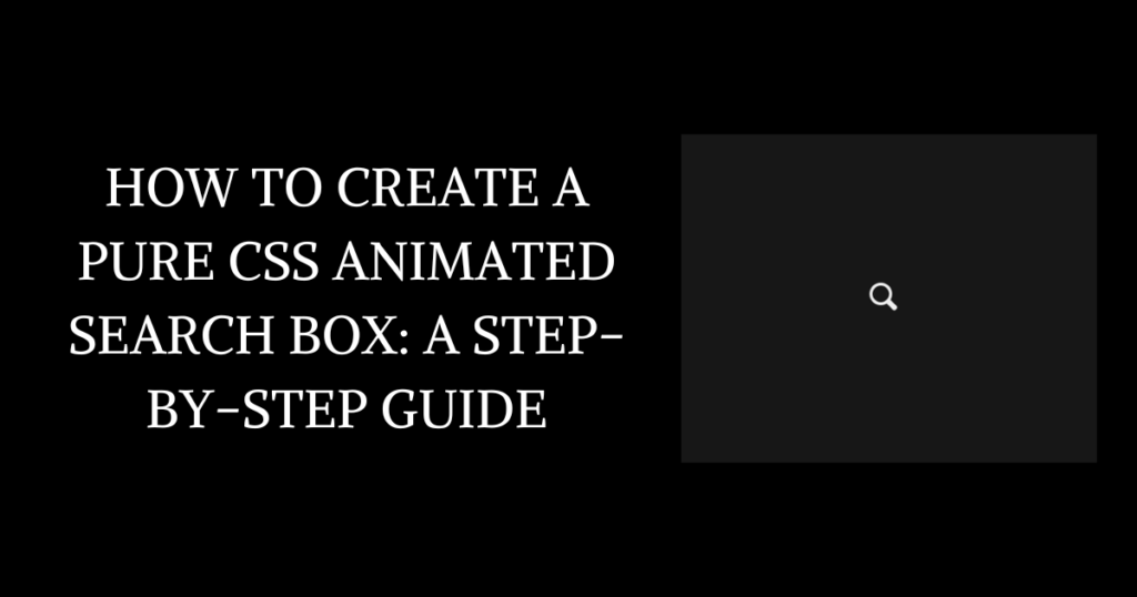
}Final Output
Once you’ve added the CSS, open your HTML file in a browser. You’ll see a sleek, animated search box that expands when clicked and changes color when active.
Conclusion
And there you have it—a pure CSS animated search box that’s both functional and visually appealing! By following this tutorial, you’ve learned how to create a search box using only HTML and CSS, without relying on JavaScript or external libraries.
This search box is a great addition to any website, improving both usability and aesthetics. Feel free to customize the colors, animations, and styles to match your website’s design.
If you found this tutorial helpful, don’t forget to share it with others! And if you have any questions or suggestions, drop a comment below. Happy coding! 🚀
That’s a wrap!
Thank you for taking the time to read this article. I hope you found it informative and enjoyable. If you did, please consider sharing it with your friends and followers. Your support helps me continue creating content like this!
Thanks!
Kamal Pankaj😊


